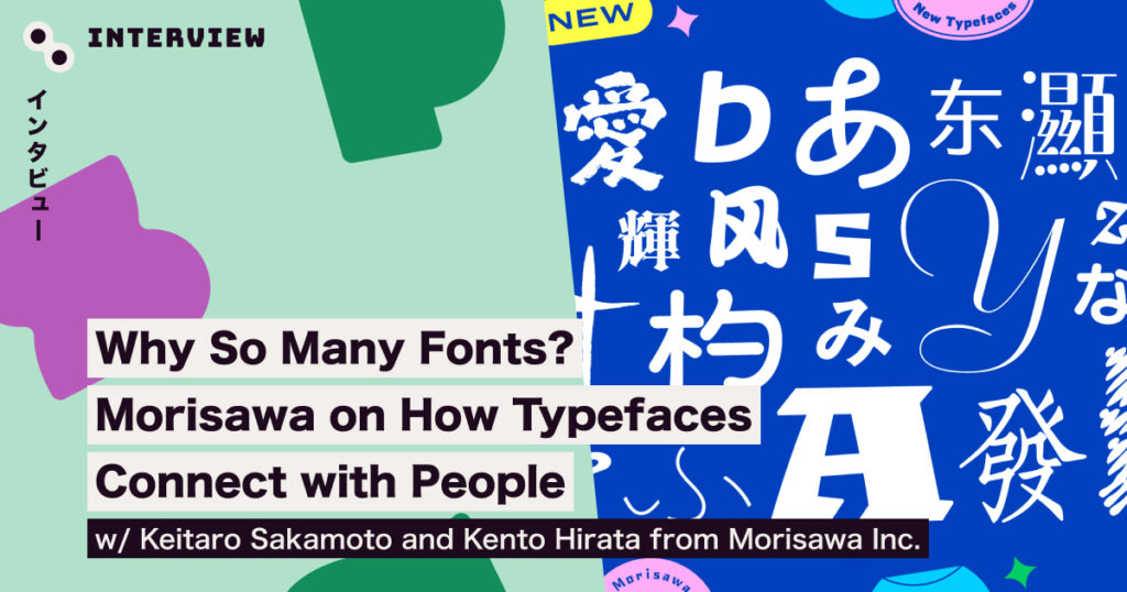
Why So Many Fonts? Morisawa on How Typefaces Connect with People
With a lineup of over 2,000 typefaces, Morisawa Fonts offers an incredible range—but why so many? And how does the company keep releasing new fonts year after year? We sat down with Keitaro and Kento from Morisawa to find out. Plus, we’ll take you inside a special workshop held at the Spectrum Tokyo Festival 2024.
Keitaro Sakamoto | Manager, Design Division, Morisawa Inc.
Keitaro plays a key role in promoting typefaces and acts as a spokesperson for Morisawa, sharing the appeal of their fonts both in Japan and around the world. His past work includes projects like Universal Design fonts, web fonts, official typefaces for international events, the revival of classic Shaken fonts, and the Morisawa Type Design Competition. In 2022, the Vaundy x Morisawa Fonts project “Okitegami” earned numerous international advertising awards. Now, as manager of the Design Division, he is dedicated to building a team that shapes the future of typography.
Kento Hirata | Typeface Designer, Morisawa Inc.
After graduating from the Department of Graphic Design at Tama Art University, Kento began his career as a UI designer at a game company, where he also worked on visual identity and concept art. In 2022, he joined Morisawa as a typeface designer, focusing primarily on custom fonts and Shaken font revival projects. Within the company, he also leads initiatives aimed at broadening the design perspective of fellow type designers.
Follow the Clues and Solve the Typeface Mystery! Workshop: Detective Type
At Spectrum Tokyo Festival 2024, Morisawa Inc. hosted a unique workshop called Detective Type. The concept was simple, but the challenge was real. The name of a specific typeface was kept a secret, and a “Guesser,” who didn’t know the answer, had to figure it out by asking questions to someone who did. Using the clues provided, the goal was to identify the correct typeface.
Participants used the Find It Through Form and Feel – Morisawa Fonts Specimen Book 2024–2025 as their guide. But with over 2,000 typefaces to choose from, could they really solve the puzzle?
Now, it’s your turn to give it a try. Read through the questions and answers, and see if you can figure out which of the 10 shortlisted typefaces is the correct one. (Don’t worry—we’ve narrowed it down for the sake of this article!)

Were you able to identify the font? The correct answer is… Gothic MB101!

From questions about design techniques, to those exploring the feeling a typeface creates and its specific use cases, we hope you enjoyed the fun of considering typefaces from different angles. Now that you know the answer, we encourage you to revisit the questions and answers.
In the actual workshop, one of the three groups managed to guess correctly! Interestingly, when a similar workshop was held within Morisawa, five out of ten teams were able to correctly identify the typeface—without the specimen book to guide them.


The Morisawa Fonts lineup encompasses a wide range of styles
When you try the “Detective Type” game, you start to wonder why certain typefaces evoke such strong impressions, and why there are so many similar fonts. Now, we’ll hear from Morisawa’s Kento and Keitaro as they take us deeper into this fascinating world.
When creating a typeface, how do you determine its intended feel and specific use cases? I’m curious about what you consider at the very beginning of the design process.
Kento: We often start by considering the feedback we receive from users who actually use the typefaces, or draw inspiration from trends.
As a foundation, our goal is to ensure that Morisawa Fonts can meet any need or convey any desired feel. Because of this, identifying gaps or missing elements in our library often becomes the starting point for a new project.
Keitaro: When developing new typefaces, our goal is to ensure that users feel confident knowing Morisawa Fonts has them covered. We carefully consider the types of fonts needed and whether there are any gaps in our current offerings. Additionally, we focus on expanding our collection, keeping in mind the subscription-based business model.
With over 2,000 typefaces already in the lineup, are there still areas that remain uncovered?
Kento: As someone who also works with typefaces, I often find myself in situations where a typeface is “80% right,” but there’s something just a little off. While neutral typefaces can work for a variety of situations, more distinctive or design-driven fonts often require a more precise fit. Even a slight deviation from the ideal can leave you thinking, “It would be perfect if only it were a bit more like this.” To create a typeface that truly meets the specific needs of designers—especially for unique use cases—a wide range of options is essential. Personally, I believe that “the more, the better.”
So, having more options is actually a benefit for users as well?
Kento: It’s true that having so many options can sometimes feel overwhelming or confusing. However, since I originally came from a UI design background, I can say quite strongly that it’s essential for users to have the ability to choose the right typeface from a large selection. As type designers, we see it as our responsibility to ensure that we’re not presenting a mishmash of choices, but instead offering high-quality options to the market.
The Three-Stage Process of Typeface Design: Concept, Rules, and Expansion
Could you walk us through the process of actually creating a typeface, and highlight any key points along the way?
Kento: First, we begin by translating the image in our minds into a tangible output. Within the company, the approach varies from person to person—some prefer to sketch by hand, while others rely on digital tools. The most important thing is to ensure that the vision is accurately represented. Some may start by imagining specific characters, while others might begin with a sequence of characters that capture the essence of the typeface.

Kento: Once the concept is refined, it is expanded into specific sets of hundreds of characters. At this stage, we select unique indicators to ensure that no characters are overlooked as we expand to thousands or even tens of thousands of characters.
What kind of characters are included?
Kento: For example, the character “永” (ei). There’s a term called “永字八法”(eiji happo) that refers to the eight essential strokes needed in calligraphy, which are all included in the character, “永”. Additionally, characters with many strokes are also considered. For instance, designing characters like “一” (ichi) and “鬱” (utsu), which have vastly different stroke counts, within the same square frame requires creating rules early on. This allows multiple people to collaborate on the expansion process. By streamlining this workflow, we are able to release new typefaces every year.
Designing a Typeface, Not a Logo: The Importance of Unity
Could you also tell us about the elements that make up a typeface and their roles?
Kento: The “structure” and “elements” of a typeface serve as its DNA, determining its overall impression. The structure refers to the core design of the letterforms, and it greatly influences the width of the counters (*) and the balance of the character. These aspects, in turn, can significantly alter the impression the typeface gives.
*Counter: The inner space formed by the strokes of a character. A typeface with a wide counter gives a more open and relaxed impression, while a typeface with a narrow counter gives a tighter, more compact impression.

Kento: For example, the “UD Shin Go” typeface has a wider structure and a higher visual balance. By utilizing the outer edges of the character frame, it creates a strong impact, especially in headlines. Since it’s designed with universal accessibility in mind, it’s carefully crafted to prevent misreading in various contexts. On the other hand, typefaces like “Chū Gothic BBB” and “Aoto Gothic” have more space inside the character frames. This prevents the text from feeling too cramped, making it easier to read longer passages.
By designing with specific intentions, the overall feel of a typeface can be influenced just by its structure.
Could you also tell us about “elements”?
Kento: “Elements” refer to the specific design features applied to a typeface’s structure that are consistent across all characters. For example, a typeface with calligraphic influences will have design details that evoke the feel of ink strokes. These elements are what help convey the overall mood or time period that the typeface is meant to express.

Once the structure and elements are set, what kind of adjustments do you make next?
Keitaro: We make various adjustments, such as fine-tuning the size of the characters and preventing distortion. But one thing I’d like to mention is density adjustment. No matter the number of strokes in a character, we carefully tweak the parts so that the overall weight feels consistent across the typeface. This helps make the font more readable and visually balanced.

How do you assess the quality of a typeface?
Keitaro: A typeface isn’t meant to be used in isolation; it’s used to form words. So, we focus on ensuring that even when many characters are lined up together, there’s no breakdown in the design. That’s the key factor that defines the quality of the typeface, and we make sure that when combining different characters, they don’t look mismatched. The overall consistency of the typeface is crucial, so we check it repeatedly in contexts like compound words and full sentences.
Kento: Ultimately, if a typeface fulfills its intended purpose, it can be considered to meet the desired quality. Typeface designers, in particular, have a sharp sense of cohesion. They are always mindful of whether the typeface can maintain its quality across different contexts, ensuring it remains consistent no matter what text it’s used for.
Keitaro: Unlike a logo, which is designed for a limited number of characters, a typeface is meant to represent all kinds of words and sentences. During development, we make sure that the typeface’s individuality and versatility can coexist by having open discussions within the team.
Adapting to Change: The Need for Diverse Typefaces to Match the Times
In the end, what would you say determines the overall feel of a typeface?
Kento: Many factors, such as the structure and elements we’ve discussed, influence the overall look of a typeface. But especially for Japanese typefaces, the appearance of hiragana, which is said to occupy more than half of the page, is extremely important. Even with existing typefaces, if you replace the hiragana with a different style, the overall feel can change quite a bit. That’s why, rather than creating everything from scratch, we sometimes suggest customizing just the hiragana portion.
Also, the impression a typeface gives is not fixed—it can change over time, sometimes unintentionally, influenced by trends in society. For example, while a soft typeface might be used on a poster, if the movie’s content is quite intense, the overall feel of that poster and typeface might shift dramatically. The old script style, which has roots in designs used in temples and shrines, is said to have gained a “scary” impression after being used in intense scenes in popular manga. As typeface designers, we always need to stay alert to how typefaces are being used in the world and continually update our awareness.

*A seal, or “hanko” in Japanese, is a personal stamp used to sign documents, similar to a signature.
Keitaro: I’m often asked, “Why are so many typefaces needed?” and my answer is, “Because humans are constantly changing.” What people find appealing always changes, and the longer the time span or the broader the audience, the more pronounced the change becomes. Just like how ancient characters are no longer used in the same way as they were back then, people’s tastes evolve, and it’s only natural for them to seek designs that fit the present.
While characters have a certain fixed form and therefore have a long lifespan, the designs that are accepted do change over time. We also want to deliver new ideas as quickly as possible.
Recently, there’s been a renewed interest in products and expressions from the Showa and Heisei eras. It seems that, similar to that, typefaces are also being reevaluated in response to the changes of the times.
Keitaro: A recent example of this is the “Shaken Typeface” we just released. From the 1970s to the 2000s, the typefaces from Shaken Co., Ltd. (Shaken) were particularly favored in professional printed materials. While these typefaces were unavailable for desktop publishing for a long time, they still have a strong fanbase. So, we worked together on a project to release them as digital fonts.

https://www.morisawa.co.jp/about/news/10088
Keitaro: During the digitization process, we didn’t just reuse Shaken’s original data (known as the Shaken Classics); for typefaces that were especially popular for body text, we took a “re-engraving” approach. This meant redesigning the typefaces from the ground up while using the originals as a reference—updating parts that were previously limited by older technology to better suit today’s standards and usage. We took into account things like family expansion, weight variation, on-screen legibility, and Adobe compatibility. The goal was to create a modern interpretation that stays true to the original spirit while being more practical and versatile for today’s needs.
Mastering the Basics of Typeface Design to Unlock Creative Freedom
When designing, what aspects should we focus on to fully leverage the power of a typeface? Also, what advice would you give to non-designers or beginners on how to choose a typeface?
Kento: Before I joined Morisawa, I worked as a UI designer, and I wasn’t always confident in my typeface choices. Even now, I find it very challenging to select the right typeface for the right situation.
Still, in design, it’s about choosing the right typeface for the scene and requirements. To do this, it’s important to understand what you are working with. When it comes to typefaces, knowing what the designer’s intention was behind creating it is the first step you can take.
Of course, in real-world design, there are many instances where typefaces are used in ways we never intended, and sometimes those choices turn out to be brilliant. However, just like with other design elements, first understanding the original intention behind a typeface allows you to use it appropriately or even intentionally break the rules. For that reason, I recommend learning about the characteristics of a typeface and understanding its intent—this aligns with the “Shu” stage of Shuhari.
Keitaro: You are free to use any typeface released to the public, but I think it’s best to first find one typeface you really like and use it extensively. This way, you’ll begin to understand what that typeface can and cannot do, as well as where it fits and where it doesn’t. If it matches your style, you can continue using it in different situations. And if you try out various typefaces, you’ll learn how to choose the right one for each specific project.
At Morisawa Fonts, we take pride in offering a lineup that meets a wide range of needs, and we actively share the stories behind our typefaces along with real-world usage examples. In addition to our Detective Type workshop, we also host seminars and events focused on typefaces and typography. We encourage you to explore these opportunities, gather insights, and discover your own reasons for choosing the typefaces you use.
For more information:
Morisawa Official Website: https://www.morisawa.co.jp/
Morisawa Global Website: https://en.morisawa.co.jp/
Morisawa’s “Handbook of Typography”: https://www.morisawa.co.jp/culture/
Official Morisawa Note: https://note.morisawa.co.jp/